pancakebunnny
needs more fartnoise
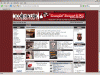
Attention illmuzik.com addicts:
I'm going to try to spice up the site in some aspects for Fade, but I need some input from alll members. I think one thing that we could improve on here at illmuzik is the continuity of the site design... Don't get me wrong, the consistancy here is better than most sites... but that's because 80% of this site is Forum-based. The BeatThis and BattleThat segments are all parts of the site as well... and I think we need to unify the design of them...which leads to... a logo.
I'm doing my thing, but who else has ideas, suggestions, feedback, etc... for an illmuzik.com logo? All members are invited to participate.
Oh... one suggestion.... please, no played-out "grafitti" fonts... the exploitation of that has made grafitti seem more of a novelty than anything. Look at the wal-mart hip hop shirts....
Things to Consider When Designing Your Logo.
A well-designed logo goes a long way in reminding your visitors who you are and what you do. Different from plain text, a logo usually triggers memories in your visitors and works as your brand name identifier.
Types of Logos
Text Only: Logos can simply be text presented to convey a company's image. Consideration should be given to color, tilt, texture and clarity in order to convey the message you want to convey about your business.
Graphics and Text: Sometimes combining a graphic or symbol with text helps to convey the image you want to project for your company. Not all graphics have to be so clearly related to a name but may instead infer strength or mobility or another concept entirely. What does that "swish" really have to do with Nike? Yet it is one of the most recognizable symbols today.
Design Considerations
Use of Shape and Color: The use of shapes and colors should take into account the business for which it is created. More conservative business, such as professional offices, financial institutions, etc., would do better to use more subdued colors. Bright colors are more fitting for retail establishments or a business whose market is a more upscale.
Keep It Simple: The reasons for simplicity are many. Practically, there is the costs of reproducing the logo across all media without the necessity of expensive reduction or separation costs. A full-color 3-D logo may look great on your web site, but there is certain sticker shock to a printer's quote to reproduce it in printed material. A well-designed logo will lend itself to black and white printing as well as color printing without losing its detail.